Fuelled by the sun, Atomiasolar’s vibrant identity is charged with energy
Atomiasolar
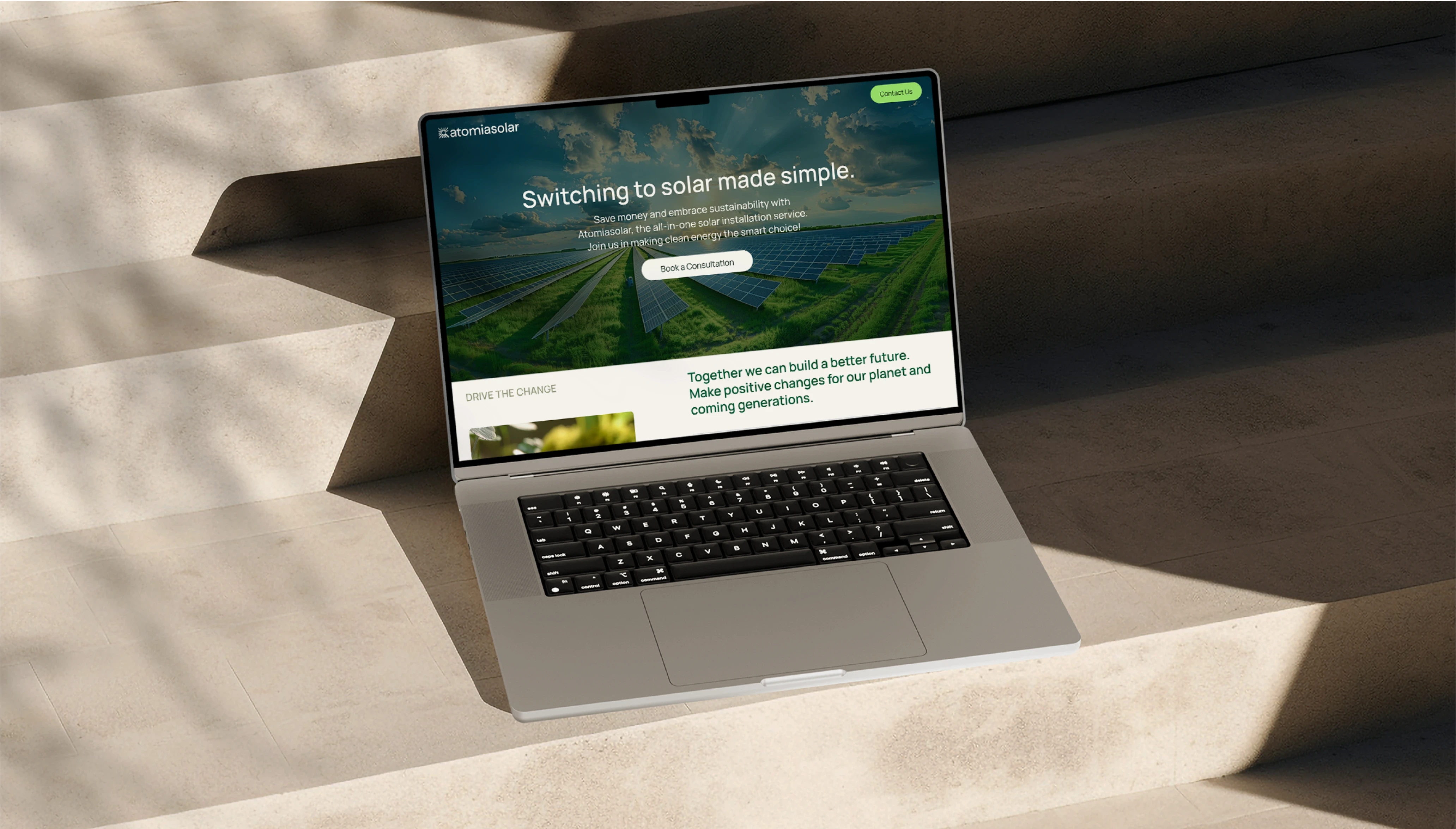
UI/UX design
Framer development
SEO
GA setup
CONCEPT
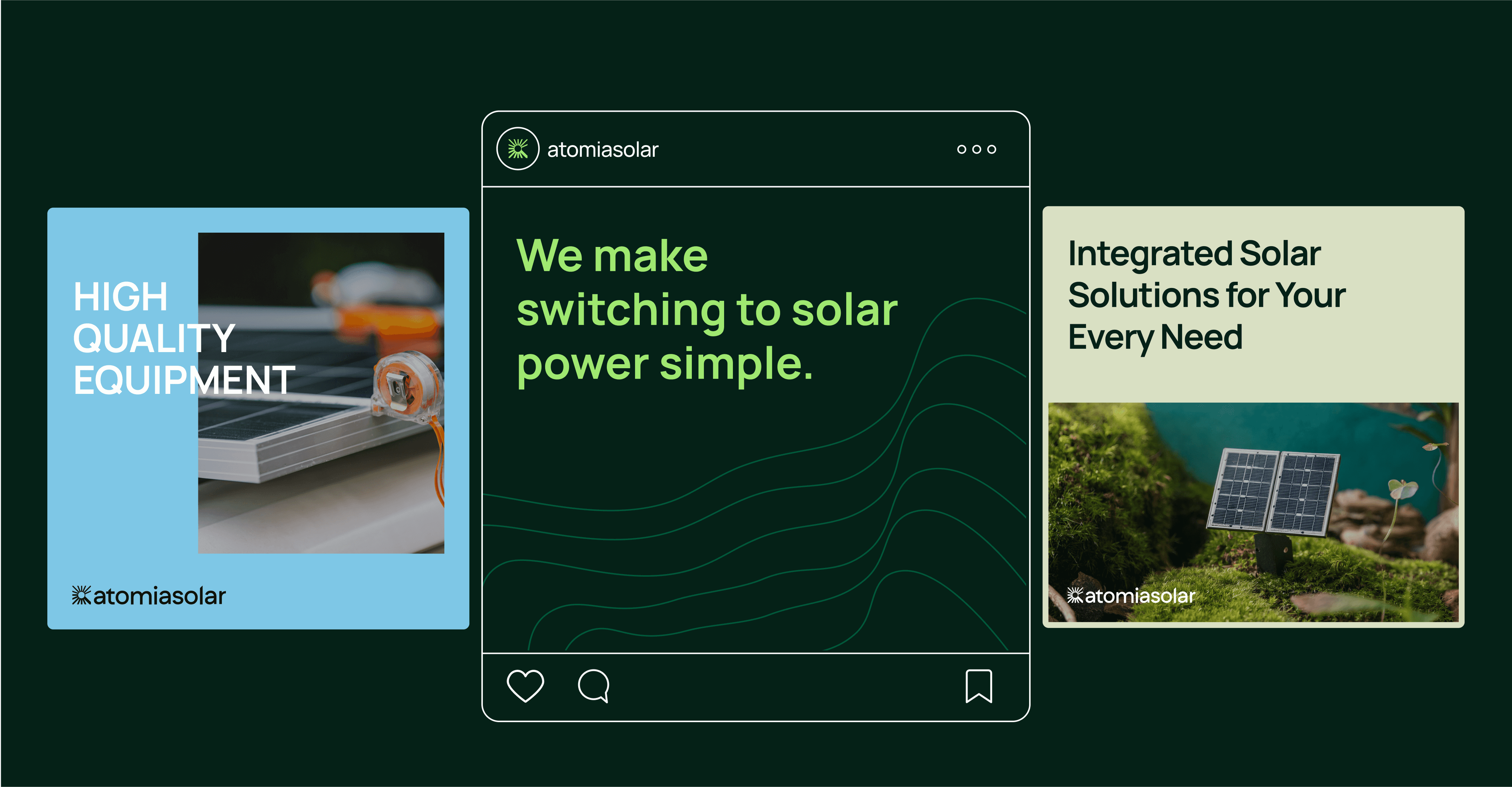
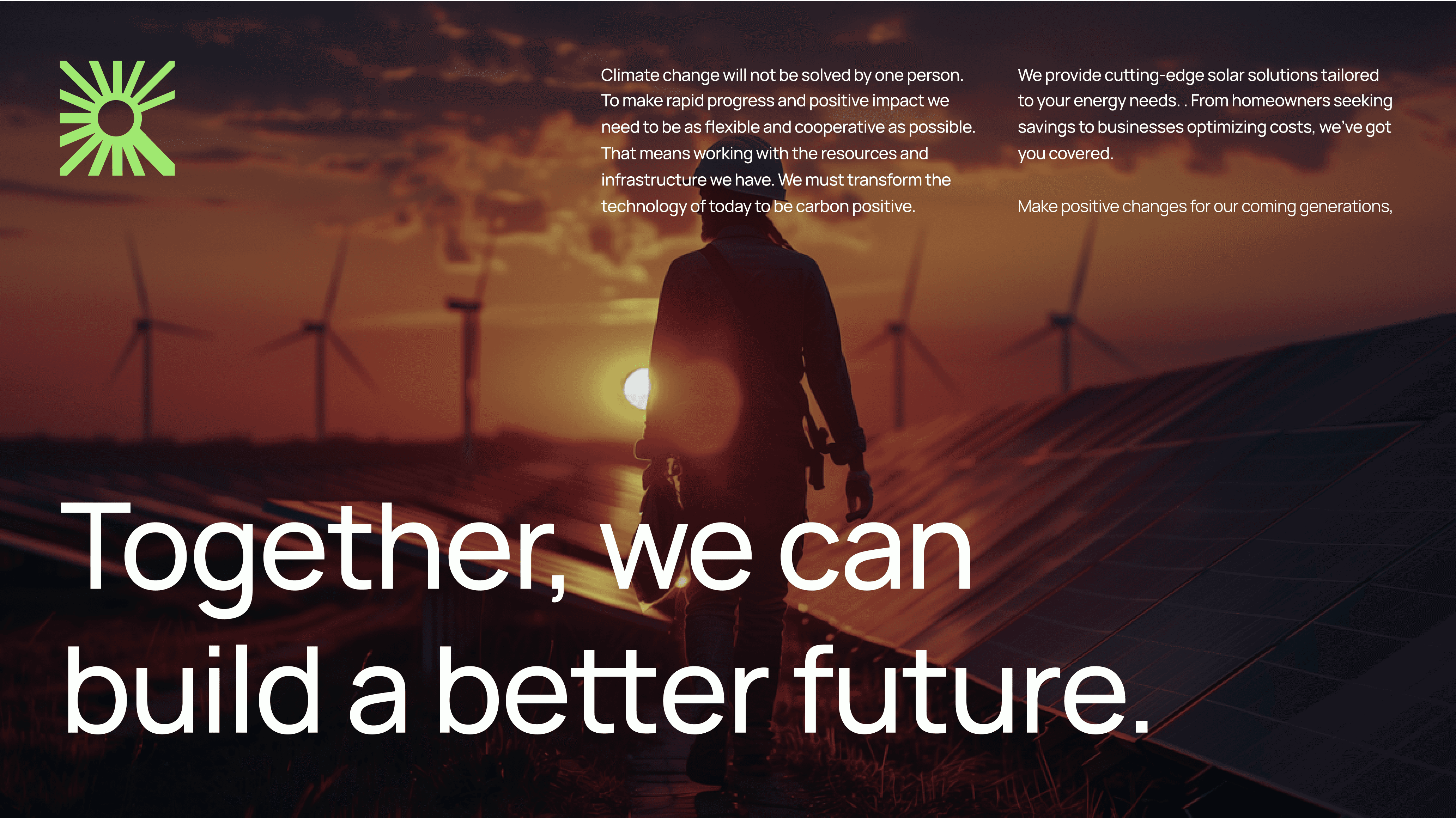
We focused on positioning Atomiasolar as the go-to partner while switching to solar solutions.The brand needed to express its strong values and ambition, to inspire change in people as well as establish its position as an all-in-one solar solution provider.
VISUAL IDENTITY
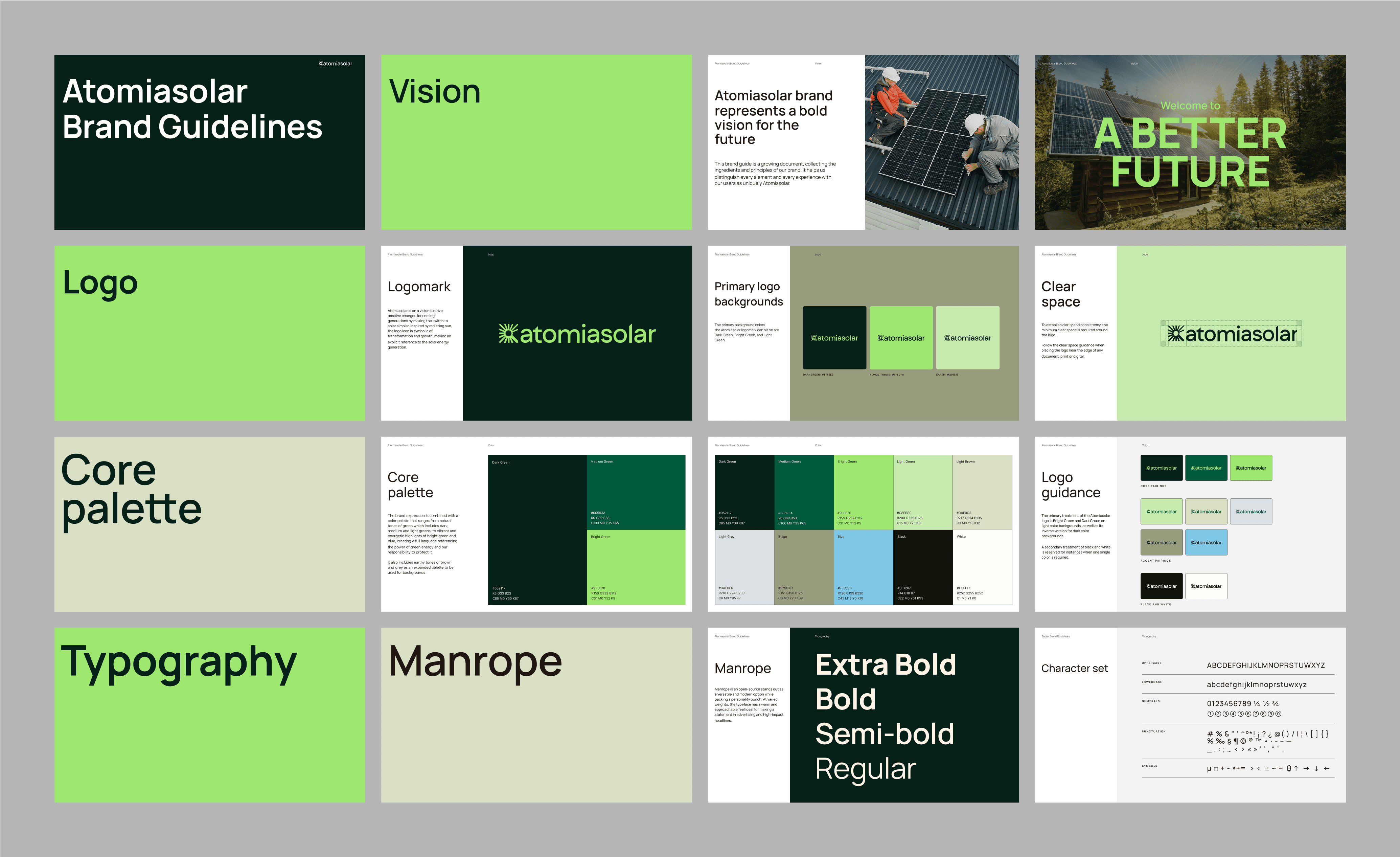
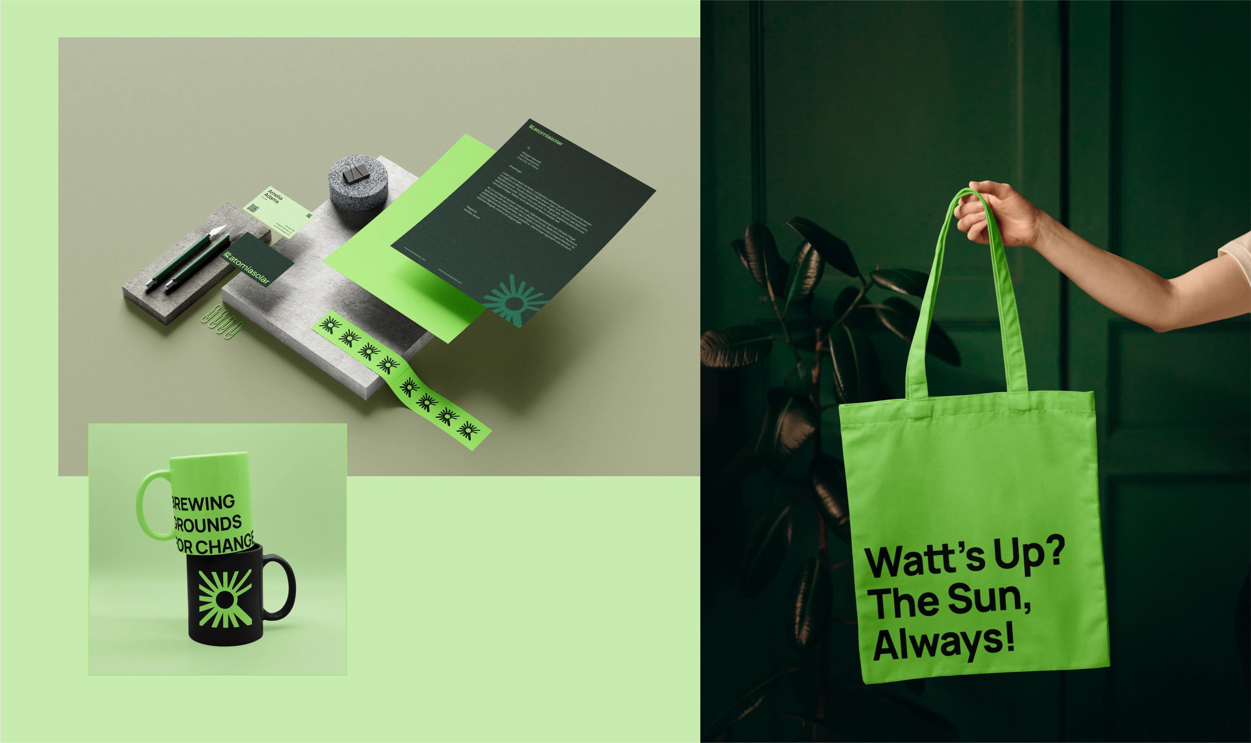
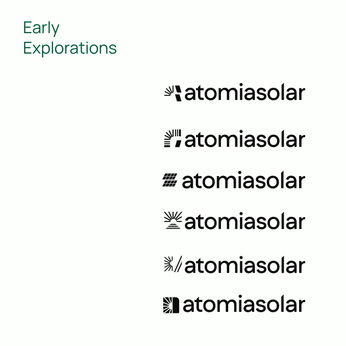
Inspired by radiating sun, the logo icon is symbolic of transformation and growth, making an explicit reference to the solar energy generation. It forms part of a dynamic brand language that constantly adjusts to embrace change.
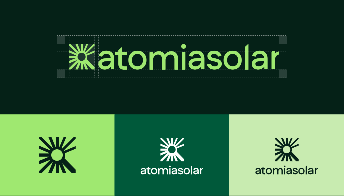
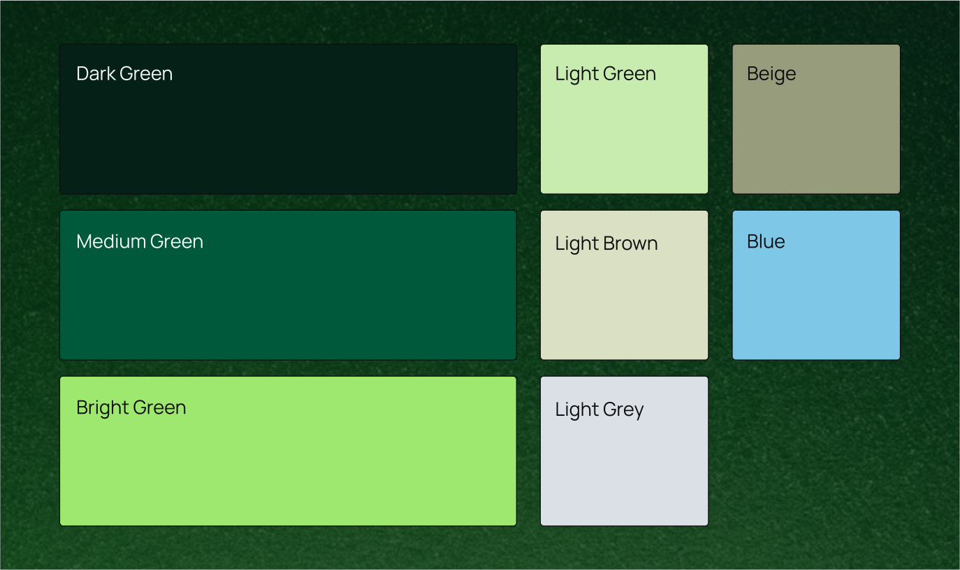
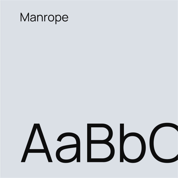
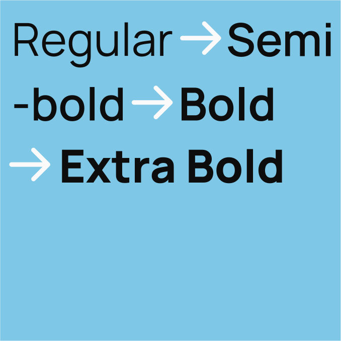
The brand expression is combined with a color palette that ranges from natural tones of green, to vibrant and energetic highlights, creating a full language referencing the power of green energy and our responsibility to protect it. The primary typeface is Manrope, with warm and approachable feel, important for small businesses.